Line Through 2 Points#
We must first create the two points as ordered pairs, then plot the line through them.
## Do not change this cell, only execute it.
## This cell initializes Python so that pandas, numpy and scipy packages are ready to use.

%matplotlib inline
import matplotlib.pyplot as plots
plots.style.use('fivethirtyeight')
import numpy as np
import scipy as sp
from scipy.optimize import linprog
Creating Two Points#
We will create the 2 points as a list:
points = ((1, 4), (2, 6))
Plotting the Line#
We plot the line using the following:
plt.plot(*zip(*points), marker=’o’, color=’green’, label=’Strategy A’)
Note that the asterisks are a vital component of this command. The plot command wants a list of \(x\)-coordinates and a separate list of \(y\)-coordinates. We “unzip” the ordered pairs and then “zip” them into the format Python wants after we entering them as xy-pairs as shown in the example above.
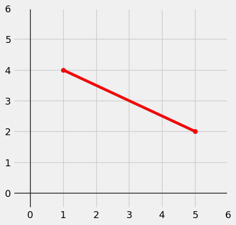
Putting it All Together#
Below, we put it all together with the XY-coordinate axes:
plots.figure(figsize=(5,5))
plots.axhline(0, color='black', linewidth=1)
plots.axvline(0, color='black', linewidth=1)
plots.xlim(-0.5, 6); plots.ylim(-0.5, 6)

points = ((1, 4), (5, 2))
plots.plot(*zip(*points), marker='o', color='red', label='Strategy A')
plots.show()
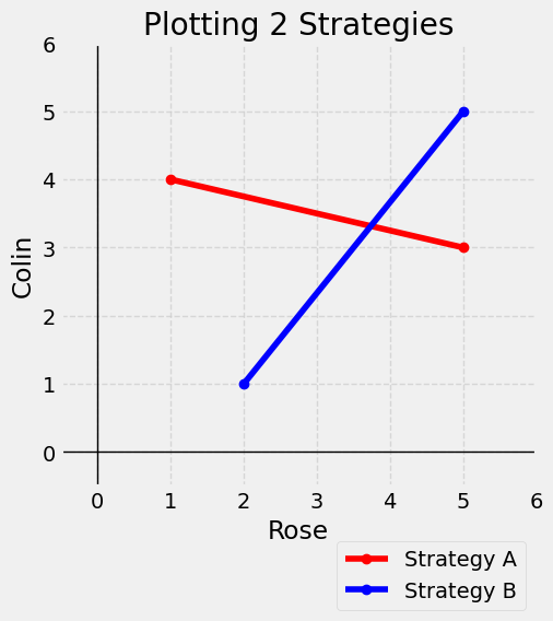
Graphing 2 Lines on Same Axis#
We will create the lists points and points2 for 2 different lines. Note that we again have added labels, a title, a legend and the dashed grid lines.
Note how the bbox_to_anchor option moves the legend outside the first quadrant so it doesn’t cover up any parts of either line in the graph.
plots.figure(figsize=(5,5))
plots.axhline(0, color='black', linewidth=1)
plots.axvline(0, color='black', linewidth=1)
plots.xlim(-0.5, 6); plots.ylim(-0.5, 6)

points = ((1, 4), (5, 3))
plots.plot(*zip(*points), marker='o', color='red', label='Strategy A')
points2 = ( (2, 1) , (5, 5) )
plots.plot(*zip(*points2), marker='o', color='blue', label='Strategy B')

# Add labels and title
plots.xlabel('Rose')
plots.ylabel('Colin')
plots.title('Plotting 2 Strategies')

# Add a grid, add legend, and place legend below figure.
plots.grid(True, linestyle='--', alpha=0.7)
plots.legend(loc='upper right', bbox_to_anchor=(1, -0.1),framealpha=0.75)
plots.show()