Graphics Options#
For the examples below, we need to load some data.
pers <- read.csv('https://faculty.ung.edu/rsinn/data/personality.csv')
caff <- pers$Caff
Main Title#
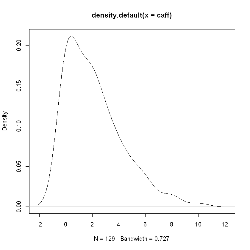
The standard titles of various graphics in R can be awkward as demonstrated below.
plot(density(caff))
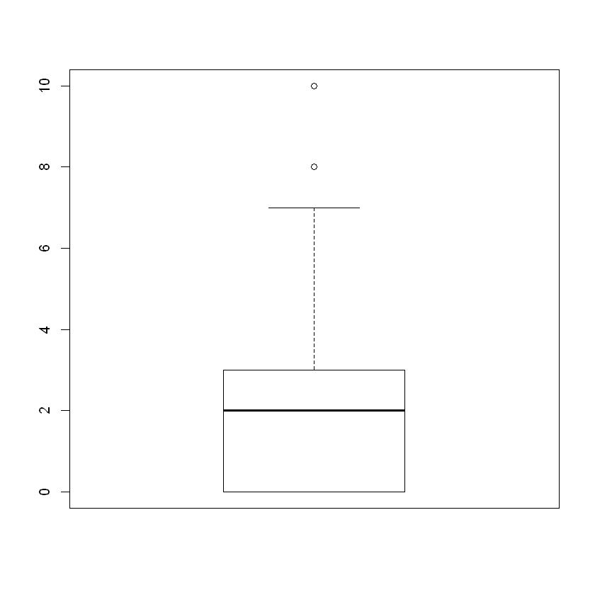
boxplot(caff)
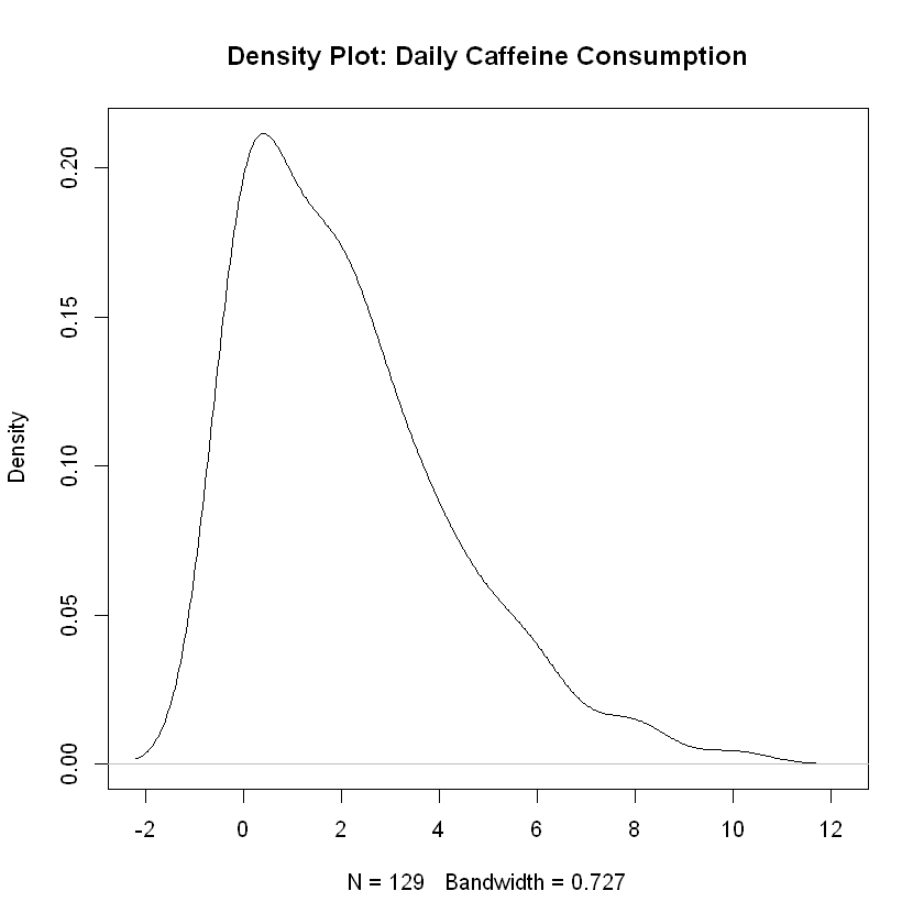
To change the main title for a graphical display, we use the option main = as shown below.
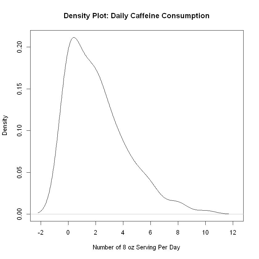
plot(density(caff), main = 'Density Plot: Daily Caffeine Consumption')
Titles for X-axis and Y-axis#
The option xlab controls the \(x\)-axis label while ylab does the same for the \(y\)-axis label.
plot(density(caff),
     main = 'Density Plot: Daily Caffeine Consumption',
     xlab = 'Number of 8 oz Serving Per Day',
     ylab = 'Density')
Line Width#
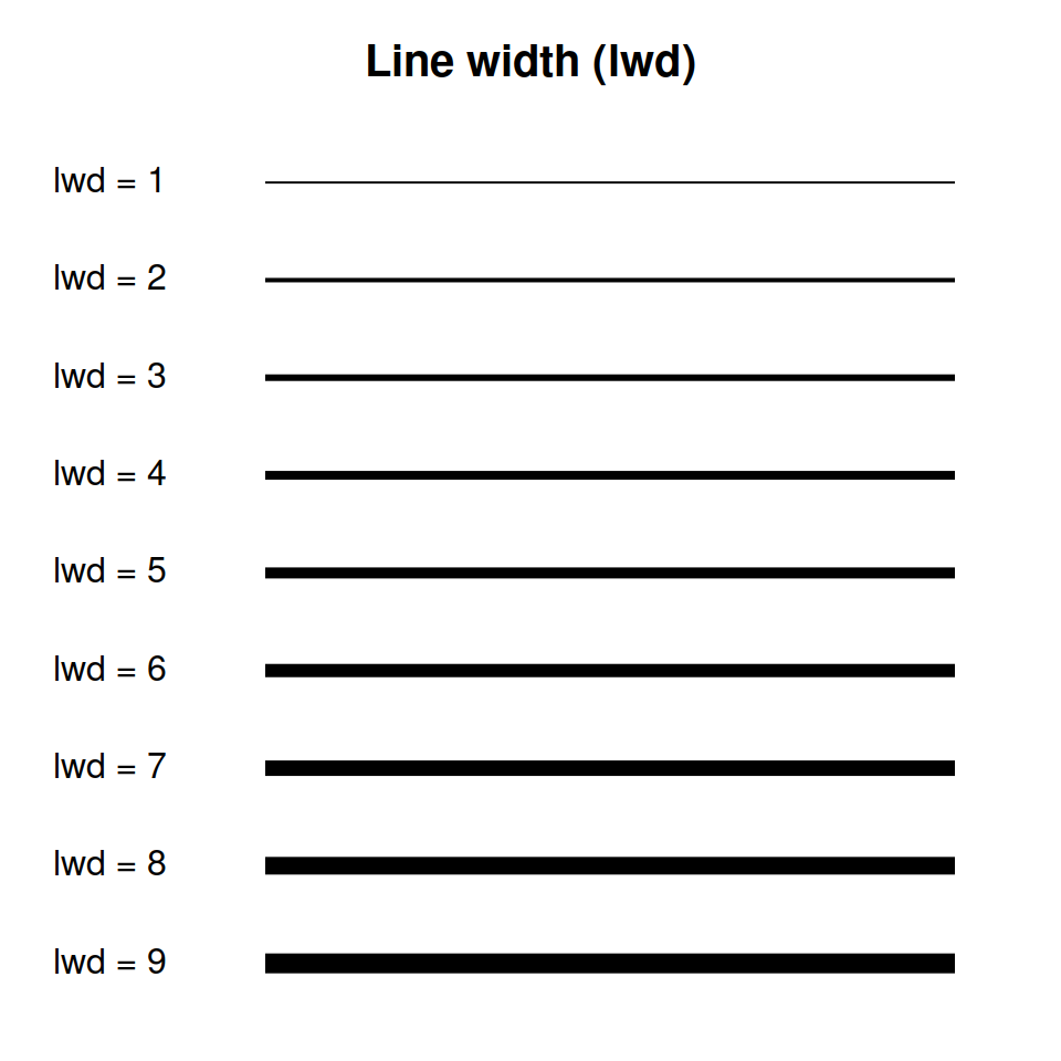
In certain graphics, we can emphasize things by increasing or decreasing line width with lwd parameter. The options available are shown in the graphic below.
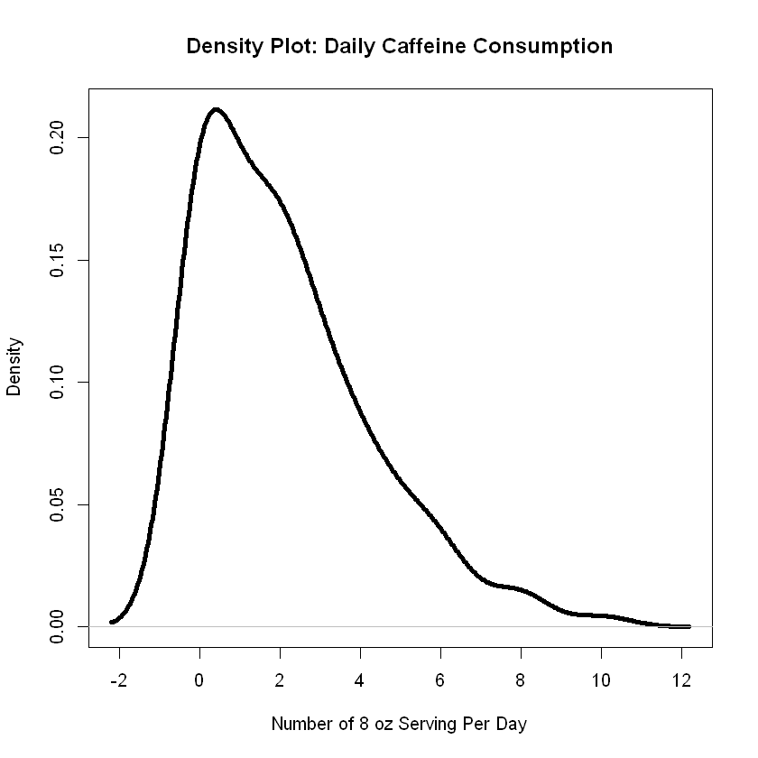
For example, let’s use a rather large width for the density plot with lwd = 4.
plot(density(caff),
     lwd = 4,
     main = 'Density Plot: Daily Caffeine Consumption',
     xlab = 'Number of 8 oz Serving Per Day',
     ylab = 'Density')
Color#
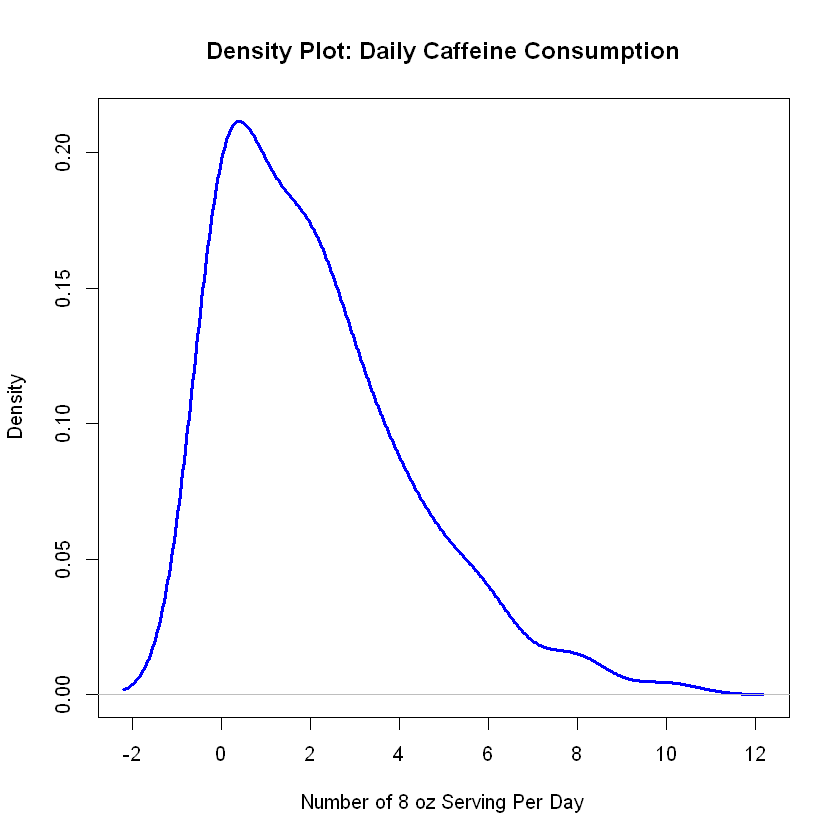
The col = parameter allows to identify colors by name as in ‘red’ or by by hexidecimal code as in #FFC00. The simplest method is use color names, as shown below.
plot(density(caff),
     lwd = 3,
     col = 'blue',
     main = 'Density Plot: Daily Caffeine Consumption',
     xlab = 'Number of 8 oz Serving Per Day',
     ylab = 'Density')
Other Plot Types#
R is very consistent in allowing the standard graphical parameters to operate unchanged across a wide variety of different graphics. Some examples are shown below.
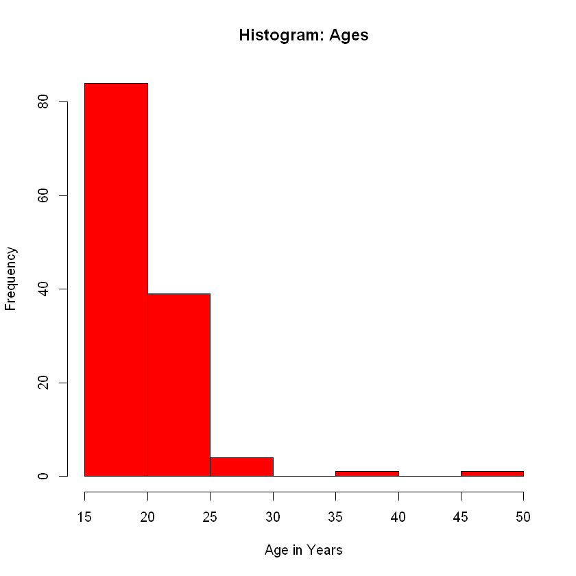
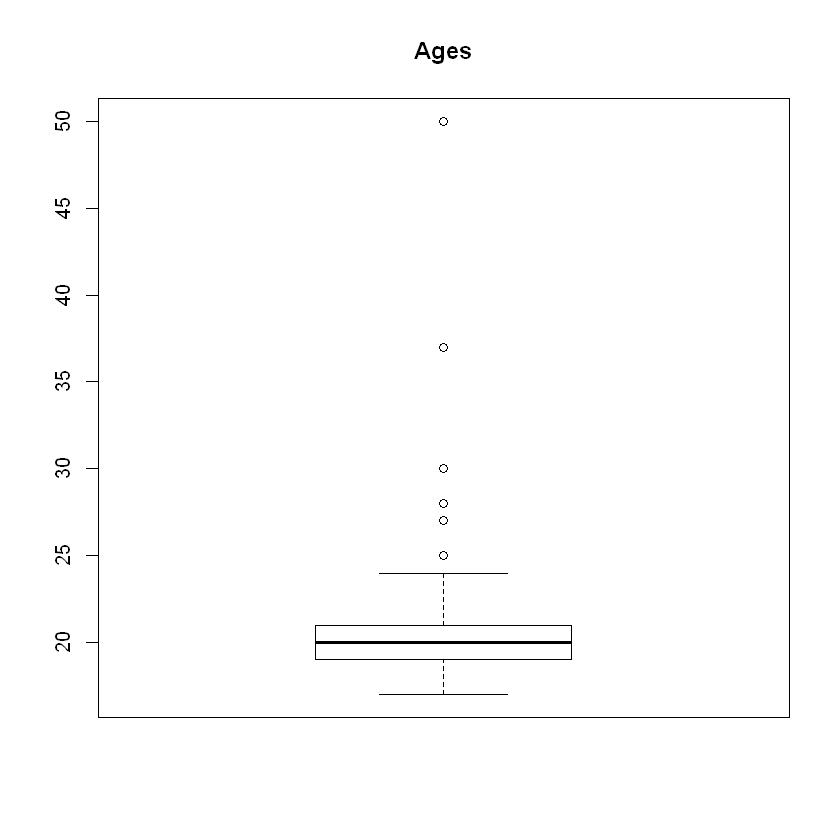
age <- pers$Age
boxplot(age,
        main = "Ages")
hist(age, breaks = 8,
    col = 'red',
    main = 'Histogram: Ages',
    xlab = 'Age in Years')