Visualizing Data in R#
We will cover each of these in more detail within the sections where they are utilized, but you should be able to create these graphics as needed.
Histograms
Density Plots
Scatter Plots
Box Plots
Stem Plots
Mosaic Plots
Normal QQ Plots
First, let’s load our personality data frame and our Sleep column in a data vector for our examples.
pers <- read.csv('https://faculty.ung.edu/rsinn/data/personality.csv')
s <- pers$Sleep
## head(s,5)  ## Remove the hashtag comment symbols to see the first 5 entries of vector s
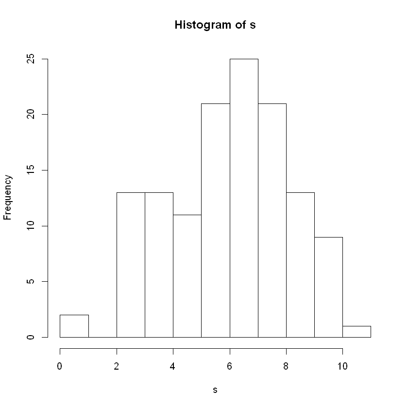
Histograms#
The standard histogram is shown below using the function hist().
Tip
We often use the parameter breaks to increase or decrease the number of bars in the histogram. The idea is to have enough bars to see the shape. Too many bars show too much detail to read the graph.
hist(s)
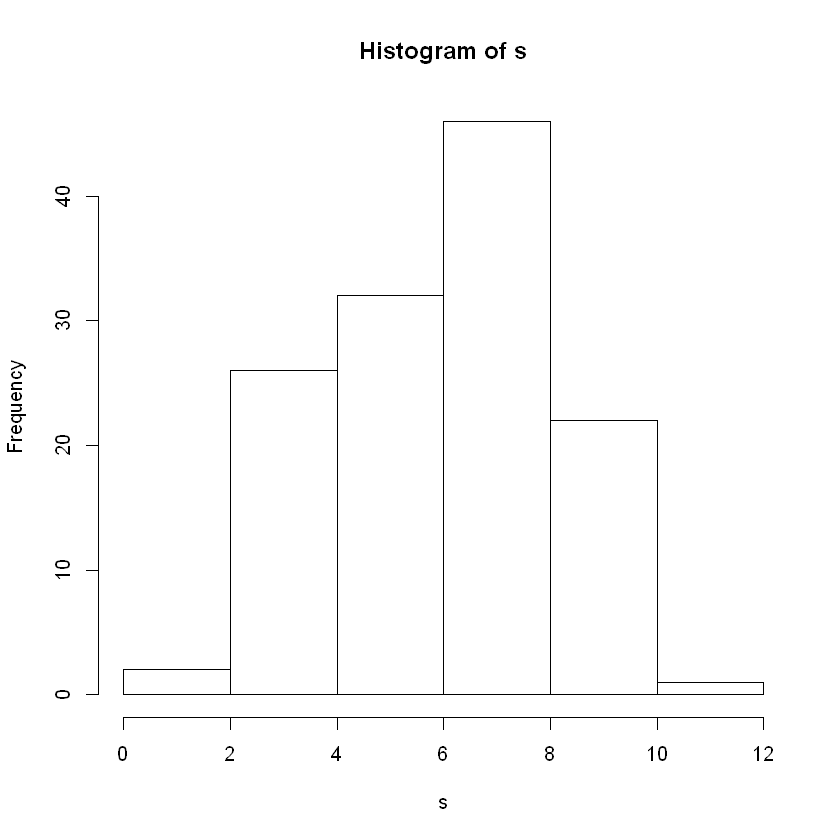
Breaks#
Try the following and see the difference it makes in your histogram:
breaks = 5
breaks = 15
breaks = 25
breaks = 50
hist(s, breaks = 5)
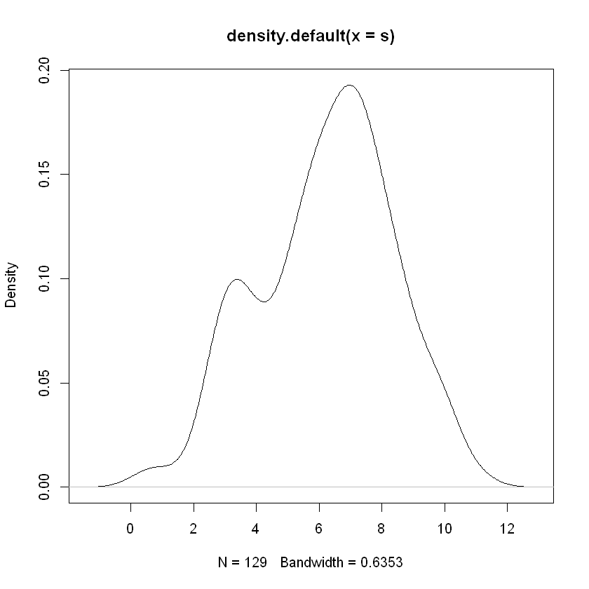
Density Plot#
This graphic functions similarly to a histogram and helps to indicate what type of distribution the data were drawn from.
Tip
The density plot can also help to illuminate various details of the distribution. Below we see evidence of a bimodal distribution emerging with a second mode starting to appear in the area where \(3\leq x\leq 4\).
plot(density(s))
Scatter Plots#
Hint
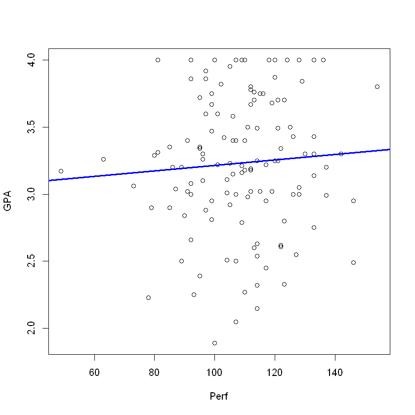
We often wish to display a line of best on the scatter plot. This involves use of the linear models function lm() along with the abline() function which adds a line through the current plot. For a scatter plot, the abline() fuction will add the line of best fit only if the lm() function has been used previously.
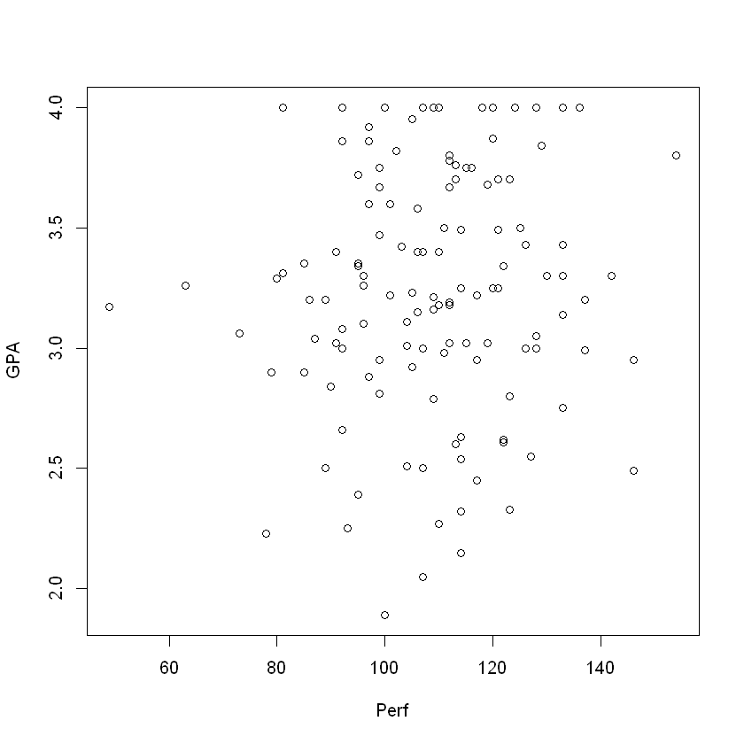
The scatter plot helps to identify whether two numeric variables are related. In the personality data set, let’s check for a relationship between Perfectionism and GPA.
plot(GPA ~ Perf, data = pers)
The process to add the line of best fit is shown.
mod <- lm(GPA ~ Perf, data = pers)   ## Create a linear model for GPA vs. Perf
plot(GPA ~ Perf, data = pers)        ## Create the scatter plot for GPA vs. Perf
abline(mod, lwd = 3, col = 'blue')   ## Creates a line based on 'mod', e.g. the linear model
   ## lwd option controls line width
   ## col option is for color
Statistical Notation and Formulas#
In algebra, we have equations like \(y = mx + b\) where a standard format shows specific things. In statistics, we have formulas like
where, if \(y\) is numeric and \(A\) is a category variable, R subsets \(y\) by the different subcategories in \(A\). A fuller description is given at this help page.
R understands these statistical formulas within several of its commands. Specifically, we can use this notation with
box plots, and
mosaic plots.
Box Plot#
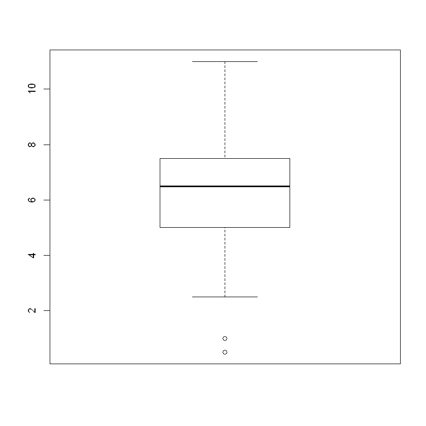
The box plot shows a visualization of the 5-number summary and simultaneously checks the data set for outliers. The box plot for a single data vector is straightforward.
boxplot(s)
Tip
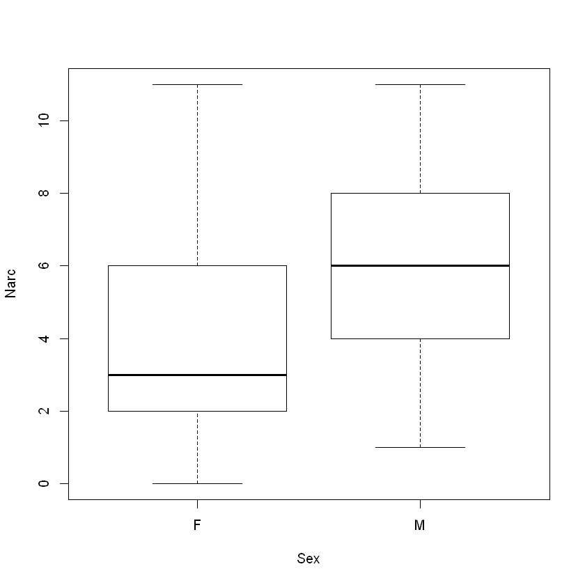
We are using the notation
where \(y\) is the dependent variable and \(A\) is a category variable to display side-by-side boxplots.
In the example below, the formula technique is used to compare and contrast the Narcissism scores for biological males and biological females.
boxplot(Narc ~ Sex, data = pers)
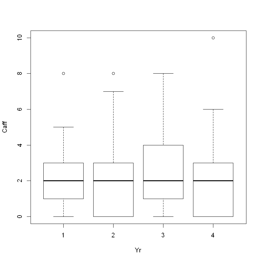
Another example will compare the caffeine consumption by year in school.
boxplot(Caff ~ Yr, data = pers)
Stem Plot#
The stem plot is a fascinting combination of a data display and a histogram. We can see the shape of the distribution yet also read off most of the data points.
Tip
The scale option controls how R splits the stems. As scale increases, so do the number of rows in the display. Again, we must experiment to find the best option trying scale values of \(\{0.5, 1, 1.5, 2, 2.5\}\) along with other values within and near this range. The default scale is 1.
stem(s)
  The decimal point is at the |

   0 | 5
   1 | 0
   2 | 5555
   3 | 0000000005555555
   4 | 00000055
   5 | 00000000055555555
   6 | 00000000000005555555555
   7 | 00000000000000055555555555555
   8 | 00000005555555555
   9 | 0005555
  10 | 00000
  11 | 0
You should experiment with different scale values as suggested above:
stem(s, scale = 2)
  The decimal point is at the |

   0 | 5
   1 | 0
   1 |
   2 |
   2 | 5555
   3 | 000000000
   3 | 5555555
   4 | 000000
   4 | 55
   5 | 000000000
   5 | 55555555
   6 | 0000000000000
   6 | 5555555555
   7 | 000000000000000
   7 | 55555555555555
   8 | 0000000
   8 | 5555555555
   9 | 000
   9 | 5555
  10 | 00000
  10 |
  11 | 0
Mosaic Plots#
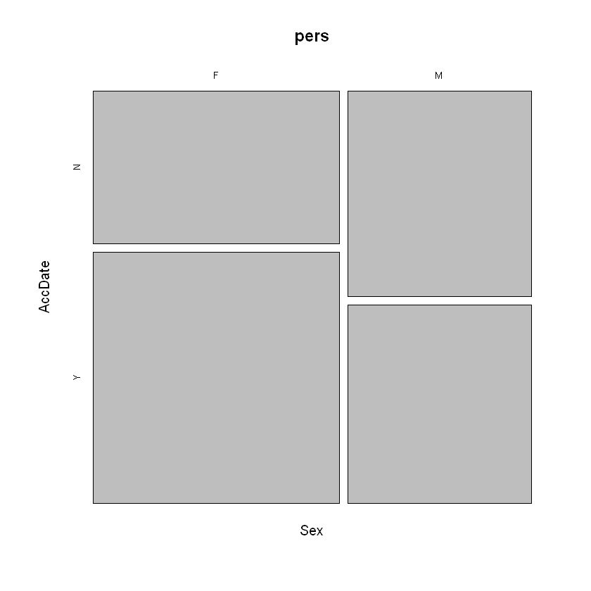
When comparing the proportions of two category variables, we can use a mosaic plot. In the example below, the answers to the “Accept the Date” questions were yes or no. The question was: “At a time in your life when you are not romatically involved, a person asks you out. This person has a wonderful perosnality, but you do not find the person physically attractive. Do you accept the date?”
mosaicplot(Sex ~ AccDate, data=pers)
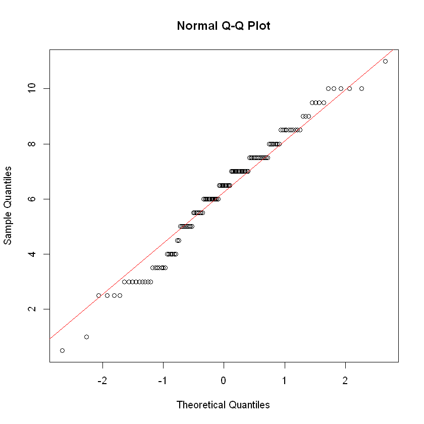
QQ Plots#
To determine if a data set appears to have been drawn from a bell-shaped distribution, we can use the function qqnorm().
Tip
The dots in a Normal QQ plot should form a linear pattern provided the underlying data are normal (e.g. bell-shaped). Using the function qqline() allows us to plot the baseline and see how the data points deviate from it or conform to it.
qqnorm(s)
qqline(s, col = 'red')